Table of contents
So, let’s say that you’ve laid all the groundwork for your brand:
You know who you are, how you want to be perceived and you have a crystal-clear picture of who your target audience is. You’ve established an authentic tone and your core values are clearly defined.
You’re ready to proceed from the brand strategy phase to designing your brand’s visual identity, complete with a logo you can be proud of.
But have you taken the time to consider what type of logo will work best for your company?
Your logo is going to do some of the heavy lifting when it comes to building brand recognition, so it needs to represent you effectively. The design decisions that go into your logo are seemingly infinite: color palette, typeface, shapes, layout… it can be a bit overwhelming. Even subtle factors can affect the way a logo is perceived, which is why you should leave the job of designing a logo in the hands of a competent designer.
Because, let’s be honest, you don’t want to represent your brand with a poorly-conceived, badly-executed logo.
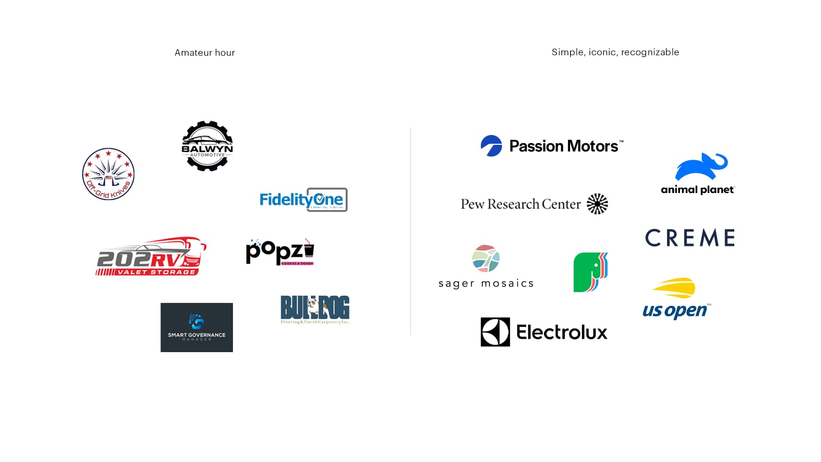
As you begin the journey toward the perfect logo for your business, take stock of the types of logos out there and get a feel for how each communicates and which ones resonate most with your brand. For our purposes, we are going to focus on four major types of logo designs: wordmarks, lettermarks, symbols, and combination marks.
Quick aside before we begin: Sometimes, I might say “trademark” or “brand mark.” These words mean the exact same thing as “logo”—it just gets kind of repetitive using the same word all the time.
Wordmark logos
A wordmark logo is entirely made out of, yeah, you guessed it: words. Specifically, the words that form your company’s name.
It’s pretty common practice to combine a wordmark with a symbol or monogram. When you do this, it’s referred to as a “combination mark.” We’ll cover those later.
For now, we’re just going to focus on standalone wordmark logos. Now, you may have a nagging suspicion in the back of your head: “Wordmarks look so simple! There’s no way I’m gonna pay thousands of dollars just to have someone type out my brand name in some random font.”
You’d be forgiven for thinking for that. The truth is, some wordmarks are ridiculously simple in their construction. But in order to come up with a solution that is both simple and yet distinctive and appropriate, using only type… That takes a lot of skill. You need to manipulate the text in a way that expresses something about the essence of your brand, and still looks simple and professional.
Without the aid of supporting symbols or pictorial elements, the execution needs to be perfect.
If you’re not a graphic designer, that probably sounds a little exaggerated, like I’m making a mountain out of a molehill. But let’s take a minute to explore the world of wordmarks and dig into what makes for a good word-based logo.
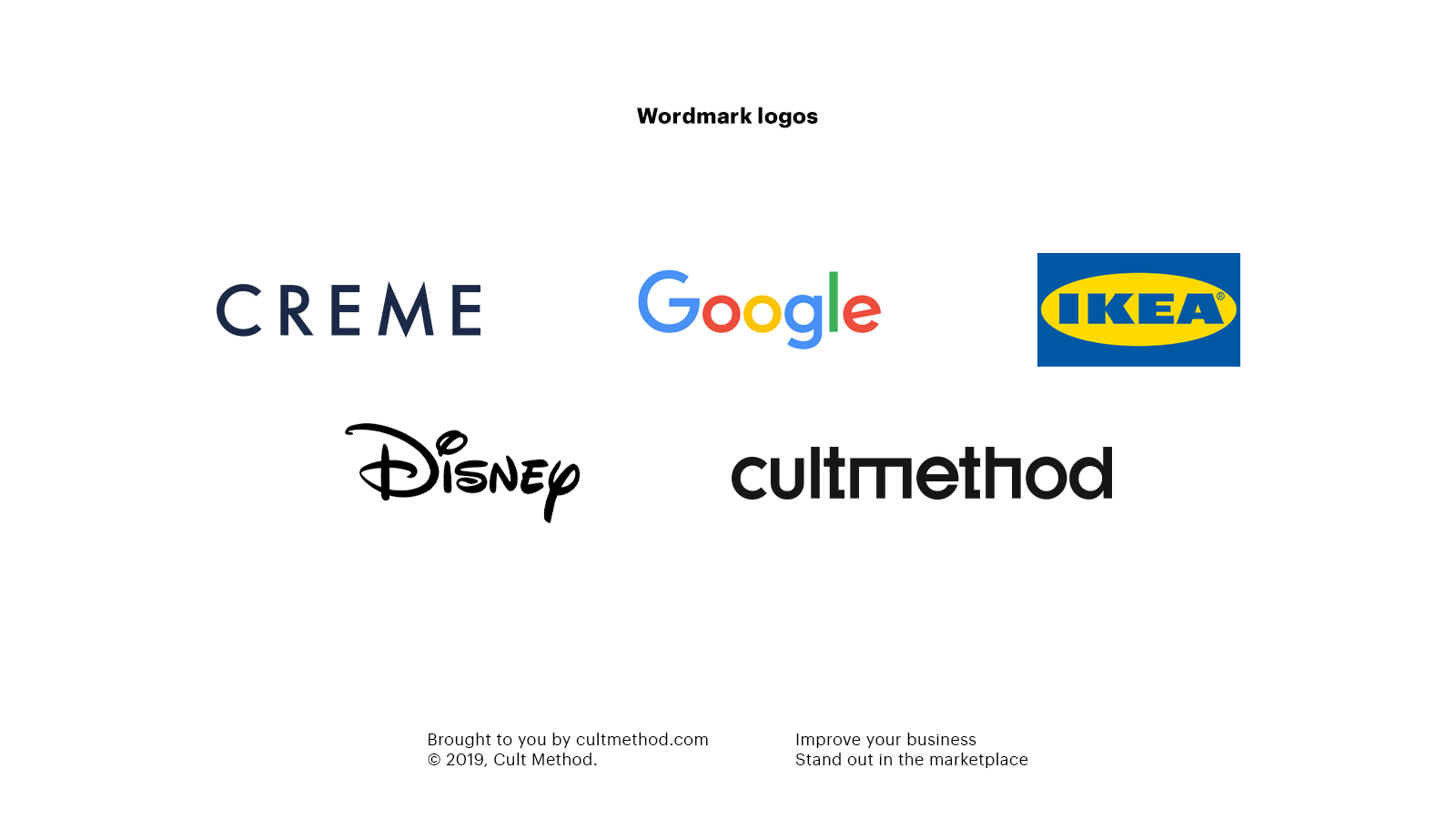
First, take a moment to picture in your head some of the wordmark logos you see on a regular basis. Google, Nordstrom, Disney, and IKEA come to mind for me. Despite only using type they all look very different from each other, and manage to capture something about the essence of their respective brands. Distinction is how your wordmark logo makes an impact and builds recognition for you. Now let’s unpack what goes into the design of a good wordmark.
Typography
Naturally, the most important element is going to be the typography itself. Specifically:
- The typeface you choose
- Type customisation
- Kerning and letter-spacing
- Uppercase vs. lowercase
Choosing a typeface
Different typefaces have different qualities. Imagine if someone sent you a business proposal set in Comic Sans. You’d file it in the waste basket, right? That’s because you could never take someone seriously who used such a silly font for professional purposes. But—surprise!—choosing the correct typeface for your logo is a lot harder than just remembering “don’t use Comic Sans.”
Typefaces are usually divided into one of two category: serif, and sans-serif. But this distinction actually says very little about the personality of a given font. A typeface can be traditional or avant-garde, geometric or humanist, international or rooted in a specific time and location, sophisticated or playful. Each typeface has a unique story to tell, and subtle differences can have a big effect on the impression that your wordmark makes on people.
The problem is: there are literally hundreds of thousands of typefaces in the world! So where should you start? Well, if you have a clearly defined brand strategy, coming up with a creative brief for the logo should be fairly straightforward. The typeface that you choose should reflect the core qualities of your brand. Any competent graphic designer will be able to find a typeface that fits your brand.
Customising the typeface
A lot of wordmark logos are actually customised versions of a typeface. Some are created completely from scratch (like the Disney logo).
There are a few reasons why you might choose to customise a typeface: maybe it’s because the typeface on its own looks a little too generic or bland. Or maybe it’s 99% there, but there is some little detail that may look great in body text, but that looks kind of “off” in a wordmark logo. Oftentimes, it’s a combination of the two.
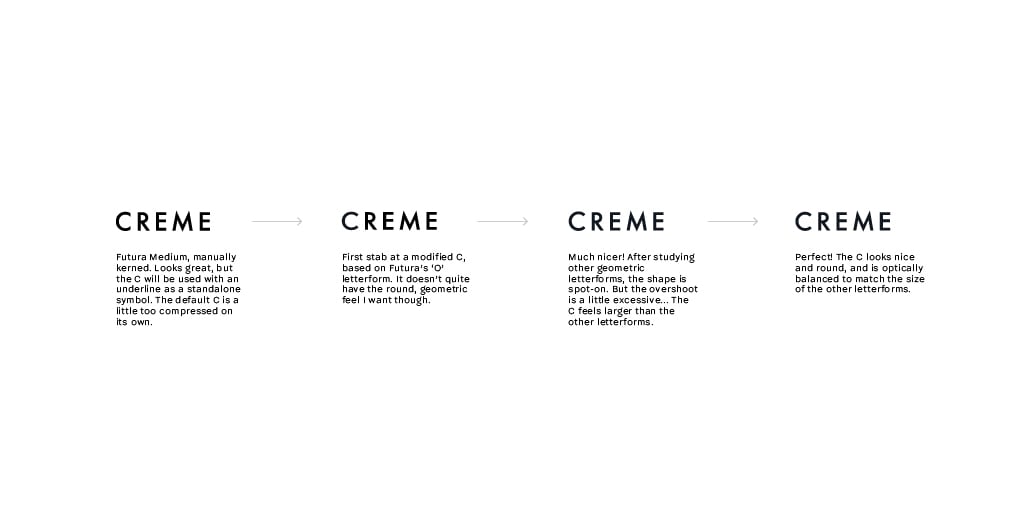
When we designed the wordmark for Creme, a high-end flooring boutique in Australia, we used a typeface called Futura.
Now, Futura is a classic. Designed by Paul Renner in 1927, it has stood the test of time and still looks fresh. But we ended up customising the “C,” to look a little more balanced. This is a subtle change, but it makes a big difference to the overall look.
The point is not to make it obvious to everyone that you’ve customised your logo: it’s to make sure it looks as good as it possibly can.
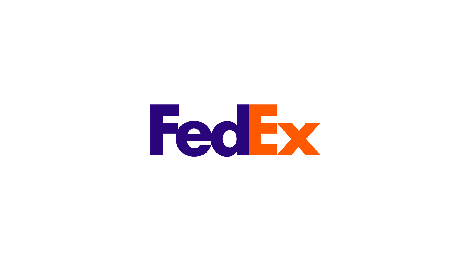
Perhaps the most well-known, and best executed forms of type customisation is the hidden arrow inside the FedEx logo. In case you hadn’t noticed (this is one of those things that aren’t obvious at first, but once you see it, you can’t unsee it), the negative space between the E and X forms an arrow. The logo was designed by Lindon Leader in 1994, and still holds up 25 years later.
Kerning and letter-spacing
In typography, there’s something called “kerning,” and it refers to the spacing between individual letter pairs. Depending on what software you use, the kerning of a specific word in a specific typeface is going to look a little different. High-quality fonts come with pre-configured kerning settings meant to make the spacing look as good and even as possible. But these settings are never perfect, and making sure the kerning looks good is really important in maintaining the professional appearance of your wordmark.
But there’s also something else, called “tracking”—or in layman’s terms, “letter-spacing.” Letter-spacing refers to the spacing between all letters. It can be tight (the letters are really close to each other, like in the FedEx logo) or loose (they’re further apart, like the Creme logo).
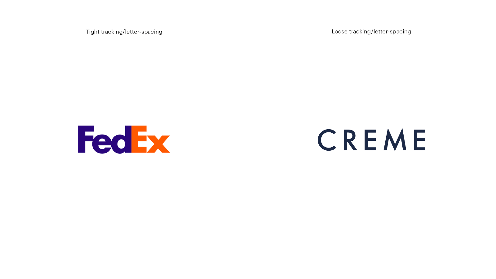
Both kerning and letter-spacing affect readability to an extent: the spacing needs to be even, and not too tight or too far apart. But kerning also affects the perceived quality of your design, whereas letter-spacing affects the look and feel of it. For example, a somewhat loosely tracked logo can often bring an air of sophistication and elegance to the mark, whereas a tightly tracked one will make the design appear more robust and “solid.”
Uppercase vs. lowercase
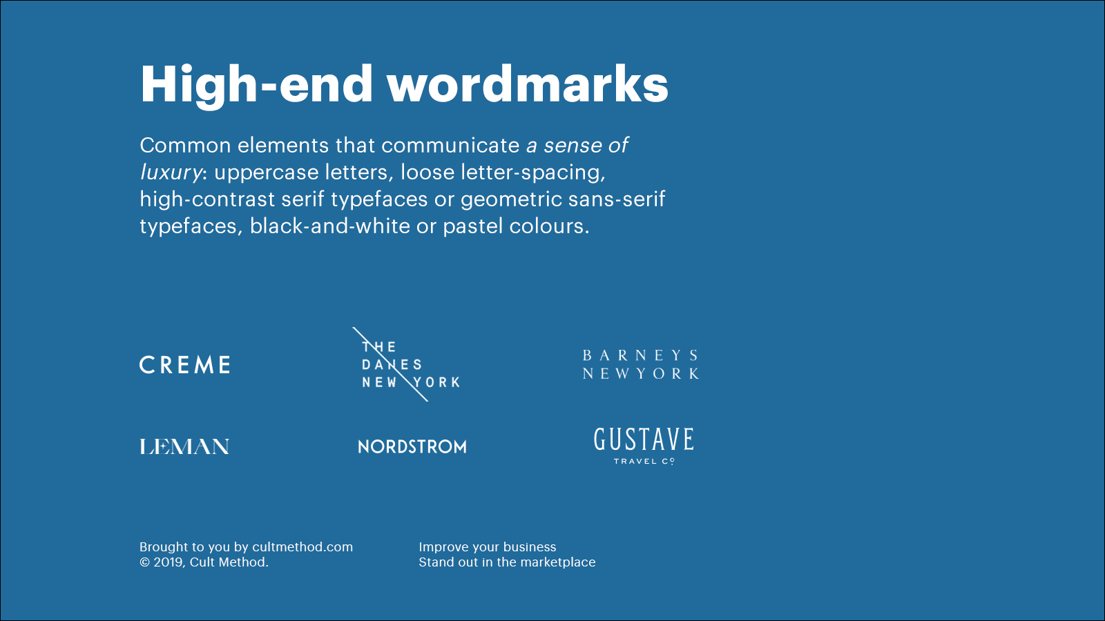
Depending on how you use capitals and lowercase letters in your logo, you can create drastically different impressions. Title case (Like This Right Here) is the default, of course. It has a tendency to feel formal. But setting your name in all-lowercase letters, for example, can make your logo appear friendlier, a little less formal, understated, or playful. Setting it in all-capitals gives it more gravitas—you just have to be careful that it doesn’t look like the logo is shouting at people.
color
Can you imagine the Coca-Cola logo in blue or green? The idea is bizarre, because the color red is so integral to the brand. color is one of the most important elements in creating a recognizable brand identity, so if you have your heart set on a colored wordmark, do your homework to make sure the specific color you choose can:
- be extended or integrated into a comprehensive color scheme beyond just your logo design
- is appropriate to your desired brand image and sub-communicates the right things about your company
- sets you apart from your competition.
Here are some salient quotes from the scientific research on the role of color in brand identity design:
Successfully using color to convey corporate identity enhances consumer purchase behavior. This is because color traits affect emotions and positive consumer evaluation of corporate identity. (Source)
An organisation that selects a color inappropriate to its overall image will send conflicting signals to its audience and would need to make extra efforts to reinforce their corporate identity, while a color chosen to support corporate image will aid visual recognition and ultimately create competitive advantage. (Source)
Disclaimer about color:
While color builds brand recognition, it’s important to make sure your logo works in plain black-and-white. There are many situations where you might not be able to show your logo in color.
Plus, designing the logo in black-and-white before worrying about color is a good way to make sure color isn’t being used as a crutch to support an otherwise mediocre design.
Lock-ups
Regardless if the logo you’re designing includes just a wordmark or if it also includes a symbol or monogram, it’s a good idea to have a number of variations that you can use.
The way that the different elements of a logo are laid out is known as a lock-up. It’s the final format of a logo and its elements, all “locked” into their relative positions. Consistency is key if you want your brand to appear professional.
When should you choose a wordmark logo?
In logo design, there’s no one-size-fits-all solution. All types of logos have a different set of pros and cons, strengths and weaknesses. That’s why it’s an important strategic consideration.
First of all, I’d like to point out that wordmark logos particularly lend themselves to companies with shorter brand names. That’s partly because shorter wordmarks tend to be more visually impactful and generally look better. But it’s also because longer wordmarks are pretty unwieldy, and you’ll often struggle to apply them across a range of sizes and media. So if your brand name is long, you would probably be well served by pairing your wordmark with some kind of symbol or monogram that can act as a short-hand for the full version.
Second, and this one is a pretty important consideration: wordmarks, by definition, include your brand name. That means they’re really effective at building brand recognition. If you’re a small fish in a big sea with lots of competition, and you don’t have a lot of money to “build up” a mental association between a symbol and your brand, a wordmark may be just what you need. Wordmark logos are a growth hack for small businesses in highly competitive markets.
If your brand name is language-dependent (like Min galopphäst, one of our Swedish clients), and you plan to operate in more than one market, a wordmark will not cut it. Instead, you need to focus on building brand recognition and equity in a unique symbol that can be used to identify your brand across markets.
Lastly, even if your brand name is short, chances are your wordmark logo is not going to be very legible as, for example, a social media profile on mobile devices. If your business is digital-first and social media is going to drive awareness for you, you’ll probably want to invest in a high-quality symbol or lettermark that you can use instead.
Lettermarks & monogram logos
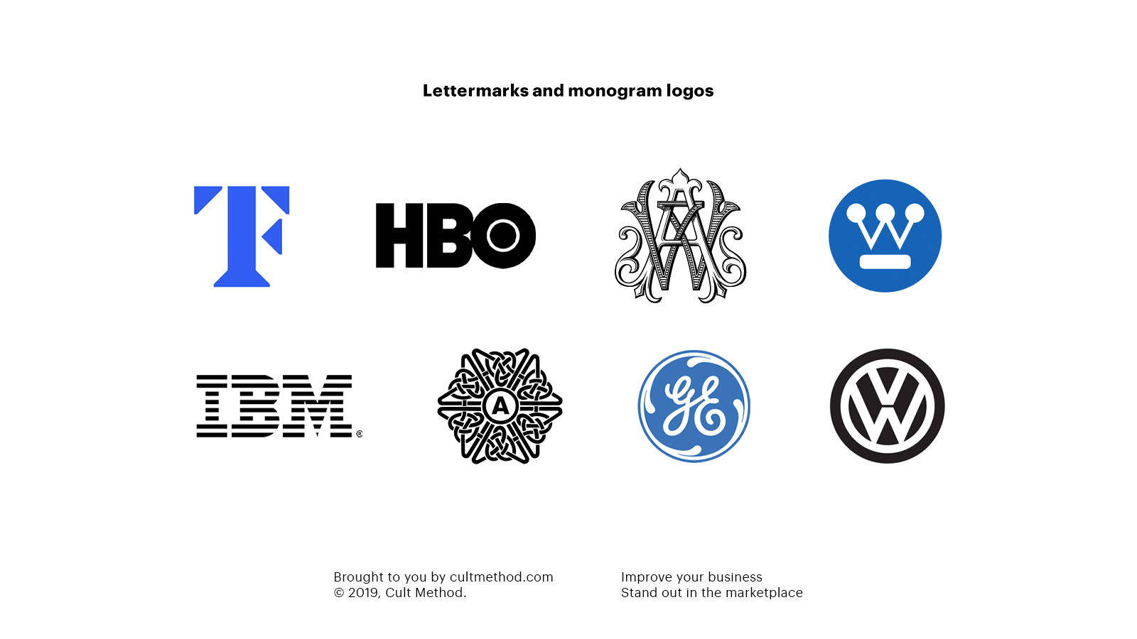
Lettermarks and monogram logos are another form of typographic logo. They are stylized versions of your brand’s initial or initials.
I’ve included them under the same heading because the difference between them is so subtle as to be irrelevant (at least outside designer circles): Monogram logos are a subset of lettermarks, where the letters are combined or overlapped.
But, like I said, that distinction is not very important for practical purposes.
Historically, lettermarks have been in use since 350BC, when they appeared on Greek coins. Greek cities—which issued the coins—would use the first two letters of the city’s name. Lettermarks and monograms have also been used by royals, in Christograms (for example the Chi Rho symbol). J.R.R. Tolkien’s monogram is another famous example.
In modern times, lettermark logos are really common. Brands like Volkswagen, HBO, Westinghouse, and IBM all use them as their main identifying marks. Even brands that primarily wordmarks to identify themselves often have an alternate lettermark version of their logo that they use on social media.
When should you choose a lettermark?
There are a few reasons why you might want to use a lettermark logo:
- In order to create a sense of heritage or as a reference to classical times
- In order to shorten a long brand name (Home Box Office -> HBO, International Business Machines -> IBM)
- In order to get around the fact that your name may be difficult for some to spell (Volkswagen -> VW)
- As a complementary mark to your main wordmark logo
Symbol logos
Symbol logos (sometimes referred to as icons) are basically the opposite of wordmarks. The thing about symbols is that they are more difficult to use as a standalone identifying mark. Big brands like Apple, McDonald’s, and Nike can do it because their symbols have so much built-in brand recognition after decades of repeated exposure and gigantic advertising budgets. If you’re not a global brand, you’ll most likely use your symbol in conjunction with a wordmark—very seldom just the symbol on its own.
Anyhow… There are basically two types of symbols: pictorial ones, and abstract ones.
Pictorial
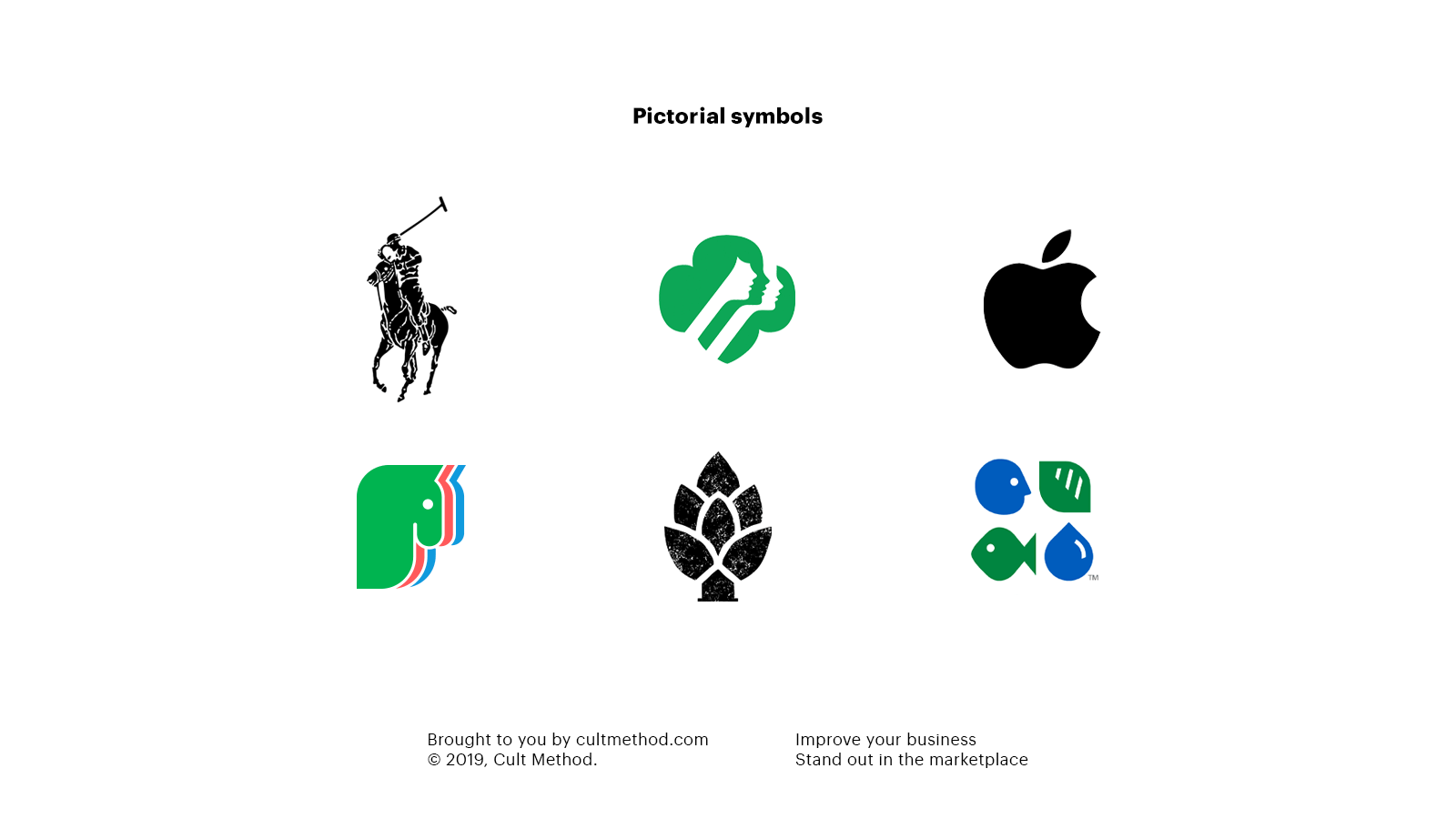
Pictorial marks are non-abstract and iconic in nature. They depict a stylized version of something—anything, really: a fruit (like the Apple logo), a mythical being (like the Starbucks mermaid or the Girl Scouts girls), an animal (like the Twitter bird or the Jaguar… jaguar), or giant piece of aircraft that happens to be smiling (like the Jetlines logo).
Some pictorial marks depict something about the industry the brand is in, but most don’t—overly literal depictions are more likely to be forgotten and are more difficult to “own”—you can’t very well copyright an outline of a house, for example.
Abstract
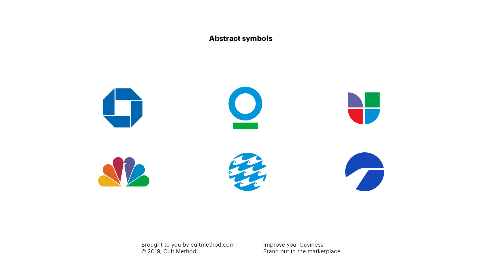
Abstract marks are, well… abstract. They usually consist of very simple geometric shapes: circles, rectangles, triangles, and so on.
When should you choose a symbol?
In general, symbol logos are long-term plays. Unless you are a major brand or have hundreds of millions of dollars to spend on advertising every year, it’s going to take a long time until people recognize your symbol and associate it with your brand. So you’ll want to use it in conjunction with a wordmark as much as possible.
Pictorial or abstract?
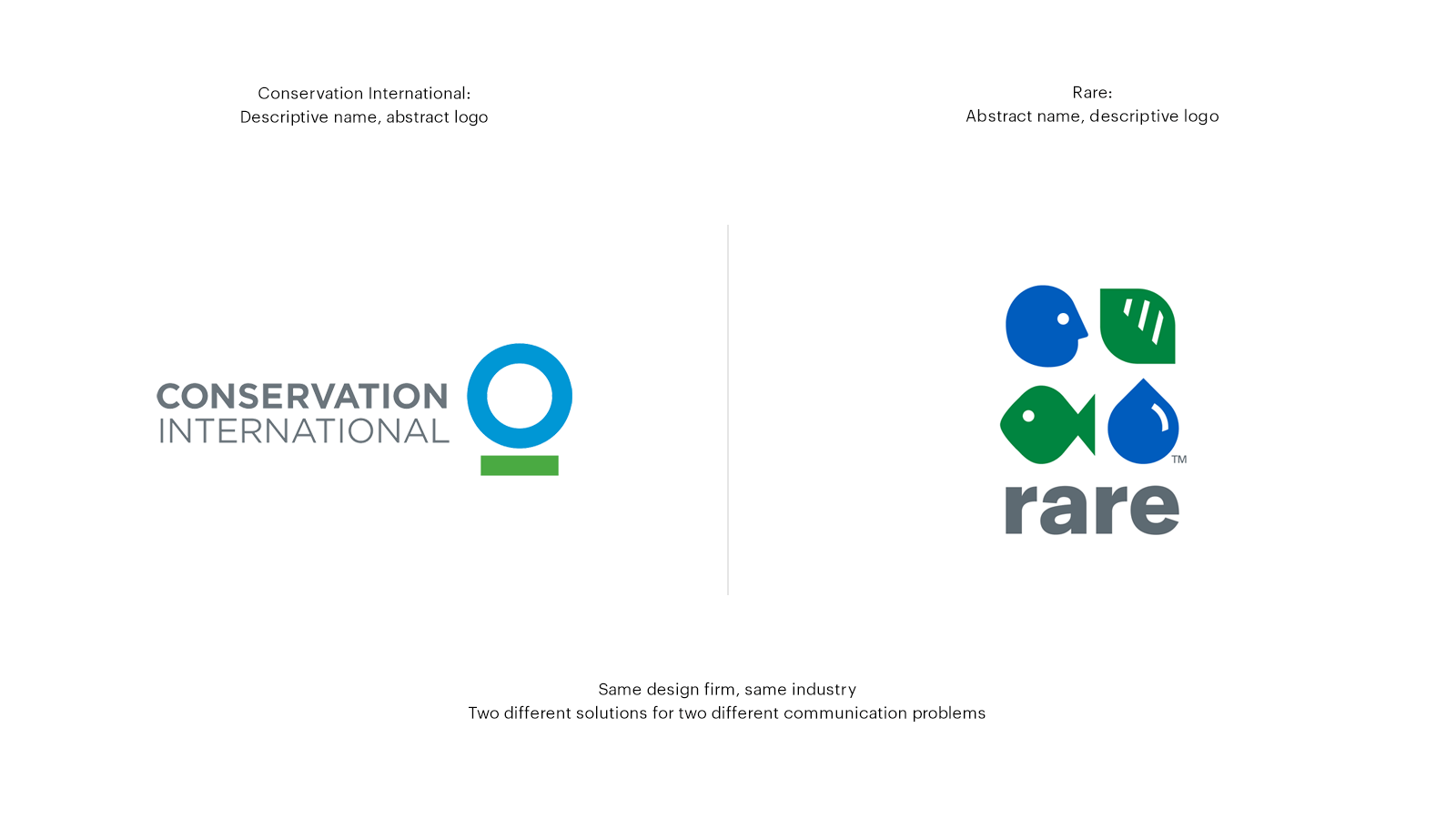
A pictorial logo may be preferable when your brand name is a bit abstract or open to interpretation. For example, the conservation organisation Rare uses a fairly descriptive pictorial mark, which incorporates humans, animals, and nature so as to clarify the purpose of the organisation. Pictorial marks can also be really effective if your brand name lends itself to a specific image: Apple and Jaguar are good examples of this. Their symbols are essentially visual short-hands for their brand names, making both the symbols and brand names immediately memorable.
Abstract marks, on the other hand, lend themselves to brand names that are more descriptive. I mentioned the conservation organisation Rare before. Well, there’s another organisation called Conservation International. Both of these organisations commissioned the same design firm to create their logos. Whereas Rare received a descriptive and pictorial mark, Conservation International received a super abstract one. But it works really well, because their logo just needs to be recognizable, whereas their name explains what they’re all about.
Combination marks
Combination marks are exactly what you think they are: a wordmark, combined with either a lettermark or a symbol.
Pretty much all brands have some kind of combination mark. The reason for this is purely practical:
Only a small number of brands are recognizable without seeing their name. Unless you’re a brand like Nike, Target, or Apple, there’s no way you can get away with just a symbol.
But, on the flip side, symbols and lettermarks are a lot easier to apply than wordmarks. Wordmarks are long, and don’t scale nearly as well.
So the ideal solution, for most companies out there who want to build strong brand identities that make a good first impression on people, and are easy to remember, is the combination mark.
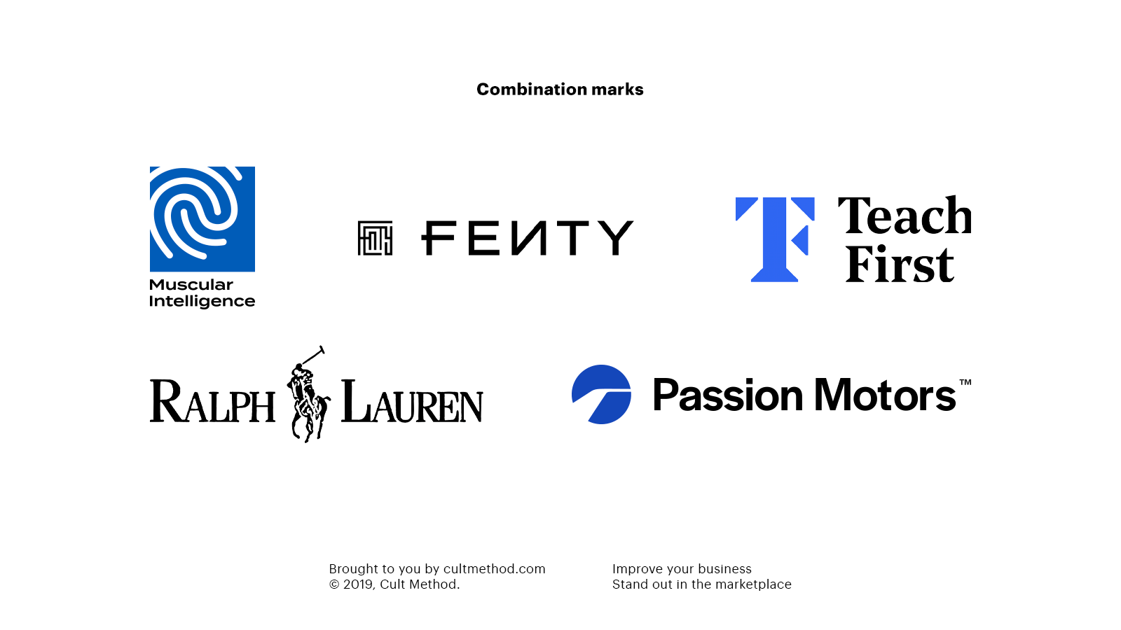
In the work we did for Passion Motors, for example, you can see the way a strong abstract symbol–in this case an icon representing a curving road–can be combined with strong typography to great effect. The wordmark conveys strength, elegance, and stability; the symbol expresses hope, movement, and the race towards opportunity. Together, they combine into a logo that evokes the feelings that the brand wants to convey: optimism and reliability.


Conclusion
Your logo’s biggest job is to visually represent your brand, and different types of logos communicate different information about your brand’s identity. From your social media to your business cards, your logo will be front and center, introducing your brand to potential customers.
Make sure you pick the right type of logo, otherwise you’ll be stuck fighting an uphill battle.