Table of contents
Earlier this month I wrote about the consequences of choice overload on retail sales, and proposed two ways retail businesses can solve the problem.
The article received a lot of positive feedback, and ensuing conversations with some business owners motivated me to write a follow-up article about specific ways you can increase sales revenue through guided selling.
But first, let’s get everyone on the same page…
What is choice overload, and how does it affect your business?
A gentle introduction to choice overload
The notion of choice overload is not new. Psychologists have been discussing it since the 1950s. But it wasn’t until 2004, when Barry Schwartz, a psychology professor at Swarthmore College, published The Paradox of Choice, that the idea entered the mainstream consciousness.
Watch Schwartz’s TED talk on the topic here:
In essence, choice overload (also called overchoice) refers to a cognitive process in which people have a difficult time making a decision when faced with many options. There are a few reasons for this:
- It becomes more difficult and stressful to determine which option is the best one for you
- As humans, we inherently feel sorrow about the opportunities that we forego
- Moreover, when it’s not clear which option is best for you, you’re more likely to regret the decision that you eventually do make
The idea is that, by reducing consumer choices you can create a better lived experience for shoppers.
How many choices are ideal?
That varies depending on the nature of the product, but one major study conducted by researchers at Columbia University and Stanford University suggests that the optimal number is closer to 6 as opposed to 24 or 30 choices.
What should you do with this information?
In our previous article on choice overload, I suggested two solutions to the paradox of choice:
- Reducing your product range
- Practicing consultative selling and guiding shoppers through a “decision funnel”
Reducing your product range
The challenge for retail businesses is that reducing your product range is not always practical.
Now to be fair, I do think that a lot of businesses can get to the sweet-spot of choice rather easily:
If you’re a men’s clothier, you might offer five different dress shirts, four different casual button-downs, chinos in three different colors, four different pullovers, two rugby shirts, one blazer, three sports coats, and so forth. Yes, that adds up to over 20 different options. But it isn’t as though shoppers will struggle to choose between a pair of slacks or a pullover. Either you’re looking for pants, or you’re looking for a sweater.
The paradox of choice really becomes an issue when all your products are seemingly similar to each other.
For example, if you’re selling printers, even having as little as four printers in each price segment can make it very difficult for shoppers who know very little about printers to make a decision. Other businesses who sell features-heavy products (RVs, flooring, computers, bedding, etc) face the same challenges.
That’s where consultative selling and the “decision funnel” comes into play.
Consultative/guided selling
In our previous article on choice overload, I talked about the benefits of guiding shoppers through a sequenced decision funnel. Here’s a GIF to illustrate the idea:
")
Later, I learned that this is simply called “guided selling”, which is a much more graceful way to phrase it.
Seven scalable ways e-commerce stores can implement guided selling
It’s simple to implement guided selling into your business if you’re a brick-and-mortar store: you just train your salespeople to be more consultative. The problem for e-commerce stores is that there are no salespeople who can help!
But that doesn’t mean you can’t guide your shoppers into making the right purchase decisions.
Below are eight scalable ways you can guide purchase decisions and increase sales as an e-commerce business (with real-world examples):
1: Product descriptions
Hopefully you are already doing this, but it would be remiss of me not to mention it here: make sure your product pages are high-quality.
Your product photography should feature the item from multiple angles, being used (this helps shoppers imagine how it would fit into their lives), next to “reference” items that establish the size of the product, and so forth. Your product details should include weight and dimensions, materials, information about where it was made, any certifications, an exhaustive list of the product’s features, the main benefits of the product (how it actually helps someone), any other perks that you offer: free shipping, lifetime support, etc, as well as embedded customer reviews.
Here are two e-commerce companies that have the essentials nailed:
Cup & Leaf
Cup & Leaf started out as a simple tea blog. Now they are killing it in e-commerce, and launching a flagship café in Austin, Texas. Their product pages contain everything a shopper might possibly want to know:
- Main selling point (“tasty blend … energizing kick that will unleash your creative energy”)
- Beautiful product photography
- Eight benefits: Energy, weight loss, blood pressure, immune boost, blood sugar, bone health, stress reduction, memory
- Background story of product
- Brewing instructions
- Caffeine level
- Countries of origin
- Verified customer reviews
- Information about free shipping


Anson Calder
Anson Calder is a premium leather goods company based in New York City. I’m a sucker for their minimal design sense, and earlier this year I became a proud owner of their card wallet.
The main selling point of the Anson Calder card wallet is how incredibly small it is. When I placed my order, I was pleasantly surprised by how much effort they had put into demonstrating its slimness.
Their product page features animated GIFs showing the wallet being used, detailed information about dimensions and how many cards it can accommodate, in addition to letting you know about the design features that make it better than most slim wallets on the market.


2: Smarter store navigation
Most online stores default to a category-based navigation. That works really well for some stores. But unless your product categories are very broad (e.g. shirts, pants, socks)—or your customers are highly knowledgeable about the products you’re selling—that category-based navigation probably isn’t all that helpful.
That’s because we generally don’t think of products in terms of discrete categories. We think of them in terms of what we hope to accomplish by buying them.
For example, people don’t care if the printer they buy is a laser printer or an inkjet printer.
What they do care about is whether it’s the best printer for their specific needs: is it capable of printing high-quality photographs of my family on thick glossy paper, so that I can create my own Christmas cards or assemble a photo album for my children to remember their upbringing thirty years from now?
If your store divides printers into laser and inkjet, that does nothing to help anyone but the most expert shoppers make a decision.
Instead, map your store navigation to different needs, benefits, or user personas.
IKEA
IKEA does this quite well: you can choose if you want to navigate based on discrete product categories, or based on “rooms.”
Makes sense, right?
Sometimes you know you need a specific type of bookcase (“I need one more Billy bookcase to fit all my leather-bound books”)—in which case the discrete product categories are great.
But quite often, you are decorating an entire room and probably can’t think of everything you need at once (“I’m moving into a larger apartment and can finally have a full home office!”).


Spy Guy
Another company that does navigation well is Texas-based Spy Guy, run by my friend Allen Walton. They’ve realized that people don’t buy spy equipment for the sake of buying spy equipment. No, people buy it to deal with a specific concern: Recording instances of workplace harassment, stopping theft, or making sure the new babysitter is taking proper care of your kids.
This insight is especially important to a company like Spy Guy, which sells products that can be very confusing to people who have never used them before.

3: Add opinionated recommendations to your product pages and list pages
If you walk into a photography store looking for a camera, the salesperson might ask you if you’re a beginner, intermediate, or professional photographer. If you tell her you’re a beginner photographer, chances are she already has one or two cameras in mind that “would be perfect for you.”
Certain products fit certain user profiles better than others, and this is where opinionated recommendations come into play. In lieu of a salesperson asking questions, just label your products instead: “Perfect for beginners,” “Perfect for small businesses with 2-5 employees,” “Perfect for the home office,” and so on.
Websites that review different products do this all the time. Unfortunately, it’s pretty rare that online stores do it (you occasionally see it with software-as-a-service companies) — but that means it’s an easy way to create a customer experience superior to those of your competitors.
Below is a product review article from PC Mag. The design is horrendous, so I’ve also created a mockup of what a good recommendation label could look like.


4: Leverage customer chat
This is the least scalable method out of the ones on this list, and ironically, I think it may be one of the most common. Thousands of online stores use services such as Intercom to allow shoppers to chat with them right from the website, in real-time.
The downside is that someone actually needs to be there, on your end, to answer people’s messages. Unless you have dedicated staff to answer questions when people ask them, a chat tool might cause more frustration than satisfaction for customers. Nevertheless, it is a way for stores to guide purchase decisions.
Personally, I think this approach makes most sense if the lifetime value of your customers is very high (e.g. for subscription-based products or high-ticket items).
5: Video reviews and demonstrations
This is one of my favourites.
Publishing YouTube videos where you review products (or demonstrate how they work) is one of the most underutilized ways to drive sales in 2020. It’s an incredibly powerful strategy, which accomplishes a number of things:
- Educates shoppers about the pros and cons of different products, and helps them feel secure in their decisions
- Builds awareness, likability, and trust for your brand
- Exposes you to new audiences that hadn’t considered buying from you before
- Drives organic traffic to your website
As you can see, guiding purchase decisions is only one benefit out of many when you produce review videos. So why aren’t more retailers doing it?
Partly because they don’t realize just how big of an opportunity it is; partly because a lot of owners feel uncomfortable in front of the camera, and partly because they think you need millions of subscribers in order to see results.
But, as a matter of fact, you don’t need anywhere near that many subscribers.
Here are a couple of companies who are successfully using video to drive sales:
Rolluikshop
Rolluikshop is an online retailer of roller shutters and roller shutter equipment operating in the Dutch and Belgian markets. After reading my previous article, their owner—Otto Tromm—told me how they are using video to help shoppers make decisions. He was also generous enough to share some figures for the purposes of this follow-up article.
The Rolluikshop YouTube channel has 1,500 subscribers. They have over 180 videos on their channel, which collectively attract about 85,000 views every month. At any given time, an average of five people in the Netherlands is watching one of Rolluikshop’s videos.
Given how narrow of a niche they’re operating in, these numbers are pretty amazing.
But of course, there’s no such thing as a free lunch. Video production costs money—and time. So how much of it is Otto spending to make these videos?
Surprisingly, it’s not a lot: about €500—or $560 in U.S. dollars—for one day of filming and editing, which typically results in about 14 YouTube videos. That’s a lot of video for very little money.
But here’s the real kicker: Because YouTube places advertisements on videos, Otto actually gets paid about €300 (or $340 U.S. dollars) every month by YouTube. You’ve heard of “free advertising” before, but have you ever heard of such a thing as “getting paid to advertise yourself”? It’s brilliant.
So the net cost to publish 14 videos per month ends up at €200, or $230 USD. That gets them over 85,000 views—a CPM (cost per thousand impressions) of about $2.70. Now, to put that into perspective: if you were to advertise on YouTube you’d likely pay closer to $10 per thousand impressions.
Spy Guy
I mentioned Spy Guy before, and I’m going to mention them here as well.
Allen Walton, the owner of Spy Guy, has done a fantastic job supplementing traditional product descriptions with video explainers and demos. The videos are nothing fancy, but they are still really effective: Allen tells me that, when they added videos to the product pages, conversion rates went up by 40%.
Shoot for the stars: Beardbrand
Now, I specifically chose to tell you about Rolluikshop and Spy Guy to show you that you can be successful on YouTube without having millions of subscribers.
But it’d be remiss of me not to show you what is actually possible on YouTube. And one business that’s truly killing it on YouTube—not just in terms of driving sales but also building a brand—is Beardbrand, run by Eric Bandholz.
Beardbrand has over 1.3 million subscribers, and every day almost 200,000 people tune into their channel. Since they created their channel in 2012, their videos have been viewed over 200 million times. For Beardbrand, YouTube is their main marketing channel (source).
You can see the difference in production quality and style of video between Beardbrand and the other examples:
- The thumbnails are simple and compelling
- The videos are well-lit and professionally shot with multiple camera angles, crisp background blurs, and high-quality acoustics
- The focus is on how-to videos, transformations, and lifestyle content relevant to their target audience, rather than product reviews and demos (although they sometimes do those, too)
Beardbrand has actually tapped into a few things that tend to do really well on YouTube: “satisfying” videos (messy necklines being trimmed, long hair getting shaved right off, even some ASMR content), big transformations (people love a good before-and-after, and there is a lot of overlap with the “satisfying” types of videos), and useful how-to content.
But their videos weren’t always like this. I encourage you to check out some of their very earliest videos, from seven years ago: vlog style content shot in Eric Bandholz’ living room, a mix of beard-specific content, product demos, and seemingly unrelated content about travel, health, and business. It took years for the Beardbrand channel to grow into what it is today.
You can read more about Beardbrand’s video marketing—and how Eric Bandholz grew the business from $0 to $100,000 Monthly Recurring Revenue here.
6: Use an interactive quiz to guide buyers
Another one of my favourite ways to guide purchase decisions and help shoppers make better decisions is by incorporating an interactive quiz on your website. Here’s why I think it’s a great idea:
- It’s an effective and scalable way to make a truly personalised product recommendation
- It brings an element of delight to the customer experience: who doesn’t like a good quiz, and the anticipation that comes along with it?
- Depending on how you have it set up, you can use the quiz answers to tailor more aspects of the customer experience than just making a product recommendation
What do I mean by the last part? Well, tools like RightMessage use quiz answers to personalise the content to a specific user on your website, and can even tag that user in your email database—which allows you to get more specific with your email marketing segmentation.
One company that has created a really enjoyable quiz is Feather, an American furniture subscription service:
Feather
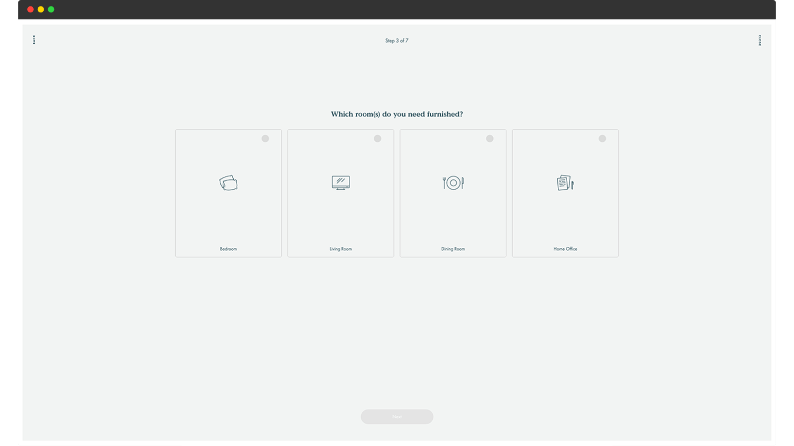
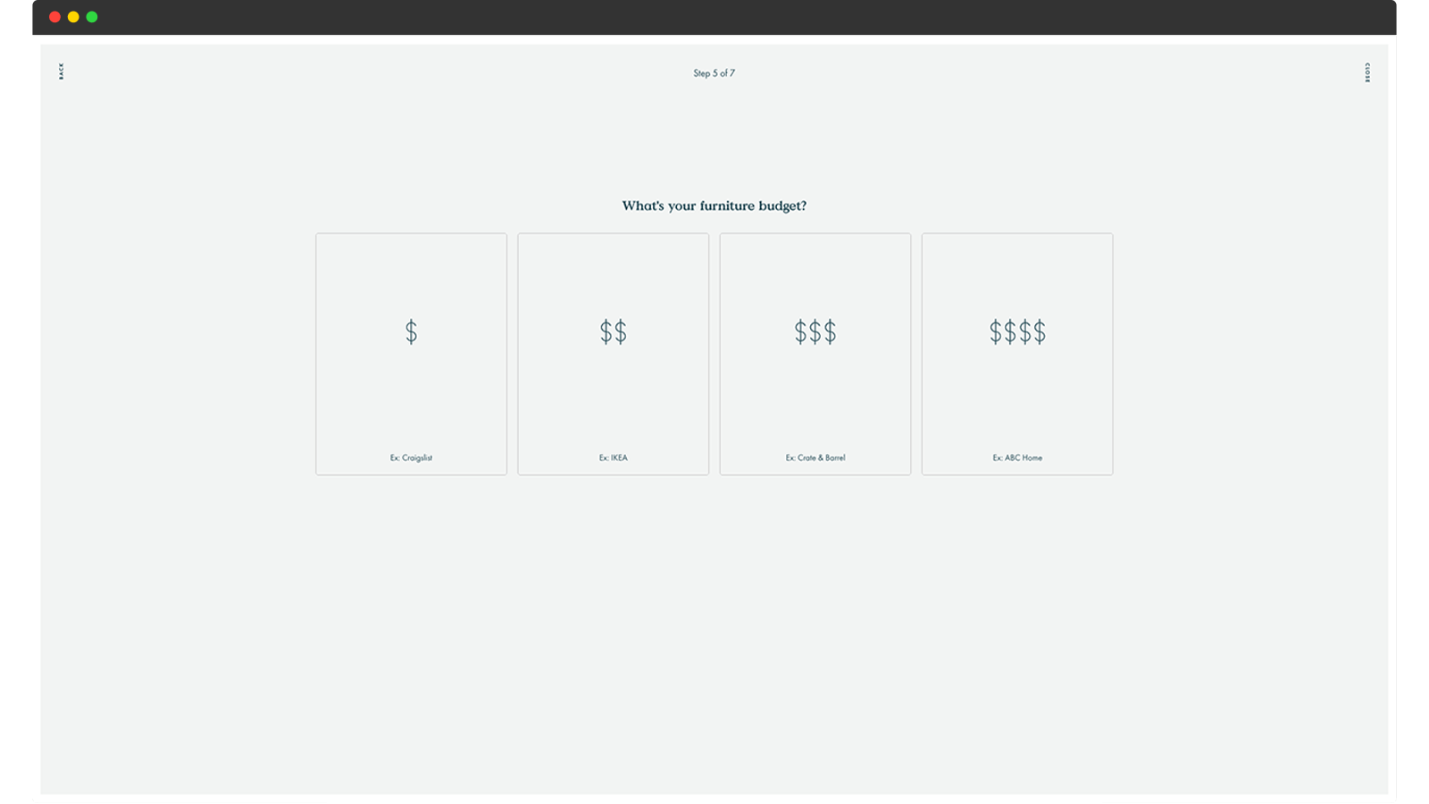
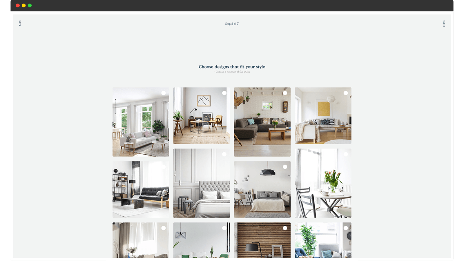
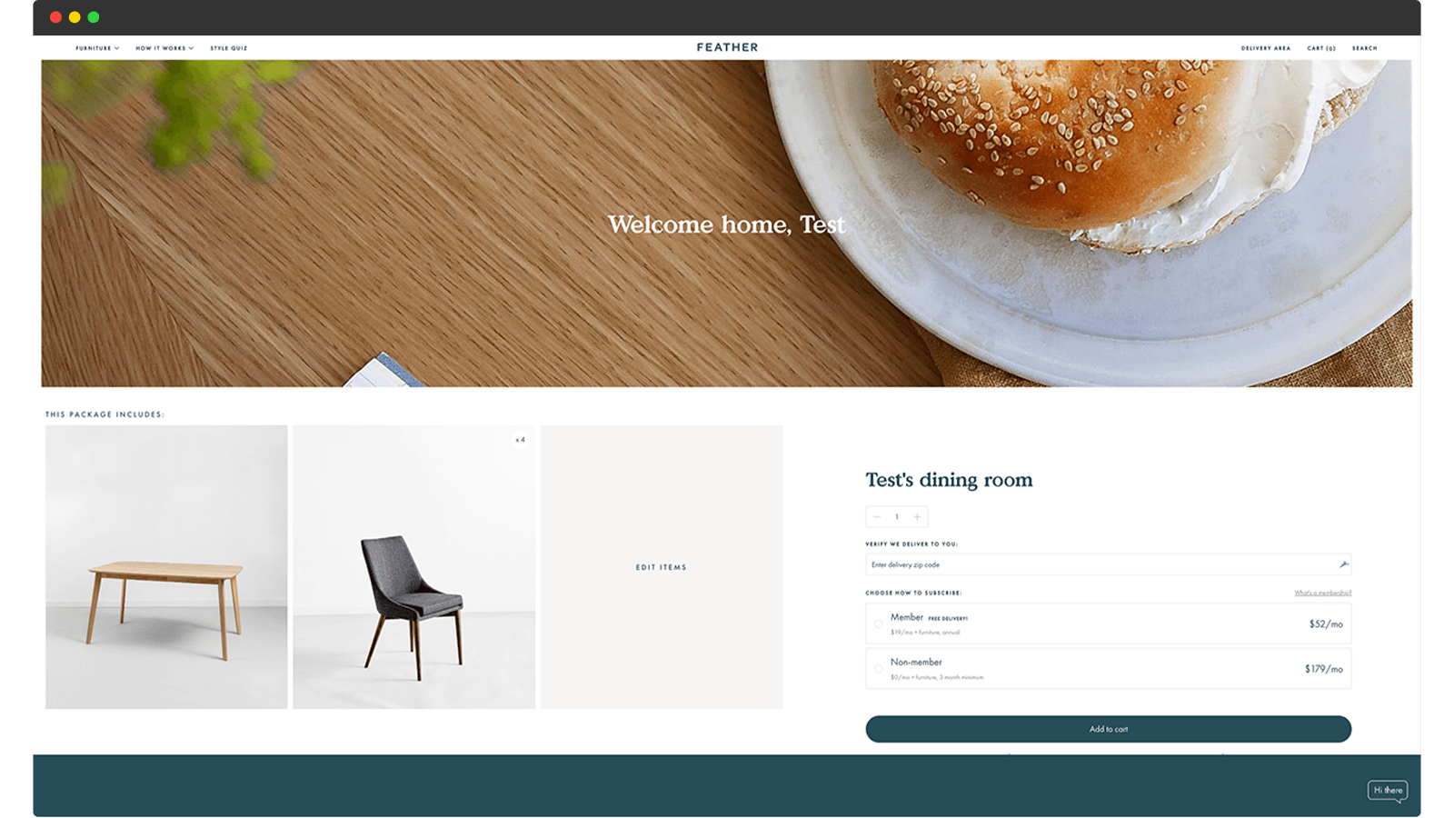
Their style quiz finds out your unique situation and needs, your budget, and your style preferences—and then assembles a customized furniture package for you. The quiz doesn’t feel cumbersome to fill out and the questions are framed in such a way that you immediately “get it” (instead of asking if your budget is low, medium, or high, they ask you to compare it to traditional options: is your budget Craigslist, IKEA, Crate & Barrel, or ABC Home?).
You’re not overwhelmed with options, but it still gets detailed enough for you to feel like Feather truly understands your unique needs.
7: Create product comparison pages
This is a very popular way to guide purchase decisions (and generate website traffic) among Software-as-a-Service companies, but can work for retailers too—especially if you’re selling features-heavy or technical products at relatively high price points.
The idea is simple: you transparently and honestly compare your product to a comparable one from one of your competitors. Here are two examples:
Fomo
Fomo, one of the leading social proof widgets on the market, has a blog post titled “Alternatives to Fomo,” where they explain how they stack up to their competitors, and when you might want to consider going with someone else.
Fomo’s article covers not just product features, but also the companies themselves—comparing their own core values to their competitors, being very upfront about biases and shady practices that some companies engage in. That makes sense, because people seldom make choices solely based on features and benefits alone.

ConvertKit
ConvertKit is an email marketing software geared towards professional content creators and small digital businesses. They have a dedicated comparison page for each of their main competitors: Mailchimp, Aweber, Active Campaign, Drip, and so forth.
Each page acts as a sort of stand-alone sales page, but the focus is on how ConvertKit compares to a similar tool. The pages feature lists and tables that make it easy to compare features, but they also include customer testimonials from people who have already made the switch from the competitor to ConvertKit.

Alright, that concludes this post. I hope it’s given you some ideas about how to take your own customer experience to the next level. If it did, I’d be thrilled if you passed the article along to someone you think would find value in it.
And if you’re thinking about ways to implement any of these ideas and would like a sounding board, feel free to schedule a casual call with me. My expertise is in brand strategy and identity design rather than Customer Experience Design, but I speak with quite a few businesses and might be able to share more personalised insights with you on a call. 😉
Here’s the link to schedule a 30-min call with me.