Table of contents
A lot of entrepreneurs and would-be business owners contact me because they want a great logo for their business.
And almost every time, I have to tell them that a logo is the last thing they need.
Hold on.
The owner of a design studio…
Telling prospective clients they shouldn’t spend money on logo design?
Something doesn’t add up here, right? But let me explain.
When I ask these entrepreneurs why they want a great logo, they tell me it’s because they want to create a great brand. I think that’s fantastic. In fact, brand is one of the most valuable assets you can invest in. In an environment with fierce competition and constant change, your brand is what will make customers choose you over one of your many competitors.
But your logo is not your brand.
If you’ve read any books about marketing or branding, you’ve probably heard that line before. What does it actually mean?
The marketing industry is full of jargon, and half the time the people peddling this jargon don’t even know what they’re actually saying. Sometimes, brand seems to refer to your logo, other times it refers to your entire business, and other times you just want to strangle the flannel-clad, tattooed marketing hipster in front of you.
Here’s the thing:
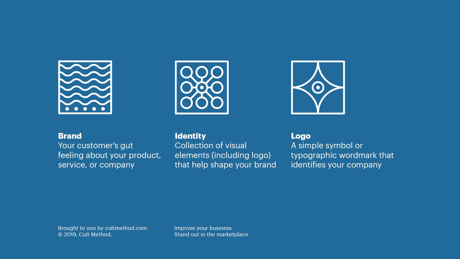
Logo and brand are distinctly different things.
Your brand is in essence your company’s reputation. It exists in the minds (and guts) of consumers. A strong, distinct brand provides you with a competitive edge: customers will be more likely to choose you over any of your competitors, they will be more loyal to you, and will even happily pay more for your products or services.
Your logo is a visual mark that identifies your product, service, or company.
If you’re of the mind that all you need is a shiny, new logo and your branding will just fall into place, I urge you to think again. Let’s dig deeper to explore the difference between brand and logo (and brand identity), so that we can better understand the value of each—and how to build a brand that puts you miles ahead of your competition.
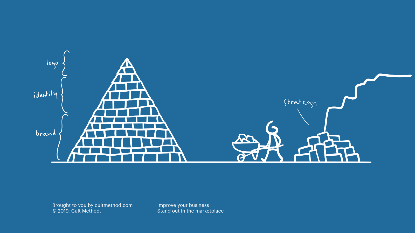
Let’s start at the bottom of the pyramid, and work ourselves up.
What is a brand (and why is it important to your business)?
A company’s brand is the set of expectations, memories, and experiences that people associate with your company. It’s synonymous with your company’s image, or reputation (kind of). Your brand is what consumers feel in their gut when they see your name, logo, or packaging—for better or worse.
Imagine that your wallet is stolen during a vacation overseas. The Chase operator takes care of you kindly, efficiently, and even has a new card overnighted to your hotel. From that moment on, whenever you see the Chase logo, you will be flooded with good memories of how the company took care of you when you needed it most. You tell your friends your story when they complain about other banks.
Do you love the bank itself? Of course not. You love the brand because of the way it fulfilled its value proposition. Does the Chase logo itself make you feel warm and fuzzy? No, that’s ridiculous, but the impression the brand has made on you does make you feel good, and that’s what you experience when you see the logo.
Can you imagine anything more important than winning the hearts and minds of consumers in business? That’s why so many business leaders and marketing experts (and I mean real experts, not clowns trying to sell their latest course in annoying ads on Facebook and YouTube) say that a strong brand is the most valuable commercial asset a company can have.
A strong brand is a business’s most valuable commercial asset. It increases the chances of customers choosing your product or service over your competitor’s, attracting more customers, at a lower cost per sale, who are happy to pay a little more, and will buy it a little more often. A strong brand will deliver more revenue, profit and growth, more efficiently, year after year, and so generate more shareholder value. It can help attract, motivate and retain your second most important asset: your people. And can work as a barrier to entry for future competitors, creating a legal ‘monopoly’.
— Tom Roach, Managing Partner at Bartle Bogle Hegarty (the global advertising firm that helped build global brands like Levi’s, Audi, Absolut Vodka, British Airways, and Johnnie Walker)
So, while your name, logo, and overall brand identity greatly influence your brand (in the same way that your clothes, haircut, and general appearance shape your personal image), they are not the be-all and end-all of your brand. Your brand is something that develops over time, and is shaped by all the little experiences and encounters people have with your company.
If that seems like a lot of pressure… That’s because it is. Everything from the way your employees greet customers, to your advertising campaigns, to your signage and your website, shapes your brand.
That’s why it’s so critically important for business owners to focus on branding efforts from the get-go.
Now, let’s look at the middle layer of our brand pyramid: brand identity.
What is brand identity?
Your brand identity consists of all the tangible elements that make up the look and feel of your brand. It’s a system that combines logo design, typography, colors, and even the sort of things you say (and how you say them). A strong brand leaves nothing to chance.
Even something as seemingly simple as product packaging can have a major impact on the way shoppers perceive your brand and whether they become loyal customers or not. The color palette you use can directly influence people’s moods, and will also impact your brand’s likability: red is famously associated with feelings of excitement, blue is associated with competence, black is associated with competence.
Consider this for a moment:
Big, recognizable brands like Apple, Coca-Cola, Nike, and Starbucks invest millions of dollars in identity guidelines that regulate how they communicate—both visually and verbally.
We’re talking the amount of space you have to put around the logo, the fonts you’re allowed to use in different situations, exact color codes for use in print and digital, layout grids for the creation of invoices, letterhead, and advertisements, the style of illustration allowed on the website, even the art direction of photography.
That’s how they manage to present the same image every time they communicate, despite having hundreds of creatives on staff and paying dozens of advertising agencies and design studios for work.
A strong brand leaves nothing to chance.
What is a logo?
After all this talk about brand, let’s go back to discussing logo design:
A logo is a graphic device that identifies a brand. Sometimes it’s referred to as a trademark. Your logo can consist of a symbol and a typographic wordmark, or even just a typographic wordmark on its own in some cases. Because the logo identifies your brand, it’s an incredibly important strategic tool.
If you get it right, you’ll have an easier time actually using it in different situations: on signage, in print materials, on packaging, as a social media avatar, on your website, on your invoices, on aluminum and on cardboard, on shirts and hats, on keycards, on your business card, on large billboards and tiny stickers, on your corporate vehicles, and so on.
In some situations, you’ll need to stitch the logo onto a piece of clothing, in other situations you’ll need to turn it black-and-white. In almost every situation you’ll need to show it in a different size.
Your logo design can also contribute to the likability, and even help reinforce something about your brand’s qualities.
Your logo shouldn’t literally explain what you do or who you are, but it should reflect the spirit of your organization and be distinctive enough to make an impression.
Why is your logo important? A great logo makes your brand stickier.
It commands attention and helps potential customers decide if they want to give you their business. Well-designed, memorable logos impart a sense of professionalism and demonstrate a commitment to quality without having to say a single word.
Your logo is the one piece of communication that customers will see almost every time they interact with your business. People will come to associate your logo with your brand (which explains the confusion about the differences between the two!).
What makes for a good logo?
All effective logos—regardless of industry, type of company, ideal customer, and current design trends—share three key characteristics. These are the qualities that any logo needs to have in order to be successful.
But first, let’s determine what your logo doesn’t need to be…
1. Your logo does not need to be pretty or love at first sight.
I repeat—it does not need to be pretty!
Far too often, logo designs are approved based on whether the owner of the company likes them or not.
Now, in an ideal world, of course everyone finds your logo pretty (including yourself). The problem is that taste is very subjective, and can be influenced by so many things.
For example, business owners tend to grow attached to the first logo that they have—not because of the design itself, but because of all the memories and associations they have attached to the design. It might be that the design is actually really poor, and doesn’t “perform” well (more on this soon): but the owner is emotionally attached to it, so they want something that looks just like it.
The good news is, you can grow to like your logo.
Earlier we talked about Chase Bank and their brand. Now, let’s shift focus to their logo (no, they’re not paying me to talk about them—but they should!).
The story behind the Chase Bank logo is a really interesting one, because it involves a lot of drama.
David Rockefeller was on the board of directors of Chase Bank, and he commissioned the now-legendary Tom Geismar and Ivan Chermayeff (then in their twenties) to come up with a new logo for the bank. What they came up with was this abstract symbol, and John McCloy—the chairman of Chase—hated it.
He couldn’t understand what the symbol meant, and he didn’t think it was representative of the bank. McCloy was really proud of their huge skyscraper in Manhattan, and wanted a picture of it as the logo.
But Rockefeller—who was more visually inclined than his colleague—insisted that they adopt the abstract mark that Geismar and Chermayeff had proposed. He told McCloy, “All buildings look the same.”
… Eventually McCloy relented.
He agreed to use the new logo in the retail bank, but told Rockefeller: “I don’t want to see it in my office, I don’t want it on my letterhead, I don’t want it on my business card. I hate the thing.”
Six months later, Geismar and Chermayeff was visiting the building and happened to run into McCloy. As they were talking to him, they realised he was actually wearing the logo: his tie had a pattern of the logo on it, and he had made cufflinks with the logo as well.
In just six months, the logo had become a representation of McCloy’s bank, and he felt a sense of ownership of it. McCloy grew to love the logo. And what a good thing that he relented under Rockefeller’s pressure: Almost sixty years later, the exact same logo is still in use, and it still looks just as good as it did in 1961.
First impressions can be deceiving!
2. Your logo does not need to describe or illustrate what your company does
In fact, this is a tell-tale sign of a bad logo. Why? Two major reasons:
-
Because what your company does today may not be what it does five years from now, let alone five decades. It’s important that your logo does not limit you: your logo should be able to grow with your company.
-
Because overly-literal logos are the resort of the creatively lazy, which is why you see them everywhere among small businesses who skimped out on logo design. As a result, they are not memorable or distinct, completely failing their most basic role of identifying your company.
So, with those anti-principles out of the way, let’s look at the three characteristics that all effective logos have in common:
1. Good logos are simple
By far, the most important consideration to make when you’re designing your logo, is that it needs to be simple. A piece of design can be a lovely picture, but if it isn’t simple, it’s not a good logo.
There are many reasons why your logo needs to be simple. Some of the reasons are purely utilitarian, whereas others are more strategic in nature.
Utilitarian reasons for simplicity
A simple logo is easier to adapt to different sizes, different materials, as well as in full-color and black-and-white.
Just think of all the places your logo might need to be visible: on your signage, on your letterhead, on your social media, on app icons and favicons, on your website, on your invoices, on aluminum and on cardboard, on shirts and hats, on keycards, on your business card, on large billboards and tiny stickers, on your corporate vehicles, and so on.
In some situations, you’ll need to stitch the logo onto a piece of clothing, in other situations you’ll need to turn it black-and-white. In almost every situation you’ll need to show it in a different size.
Strategic reasons for simplicity
Consider the Mona Lisa. One of the greatest works of art in human history. What do you remember about it? Chances are, you remember the smile. But beyond that, can you remember anything else? What sort of clothes is Mona Lisa wearing? What’s in the background? What hairstyle does she have?
Simpler designs are easier to remember. The human brain did not evolve to recall every single detail about an object. It evolved to recall the essence of it.
That is why companies like McDonald’s, Apple, and Nike have adopted extremely simple logos. They are stripped of nearly all detail; boiled down to their essentials. As a result, we remember them more clearly than we would have if they were complicated, like the Mona Lisa. And pretty much anyone can draw their logos from memory: who can draw the Mona Lisa, except for Leonardo da Vinci?
But beyond the memorability of the logo, there is another thing to consider: the logo’s longevity.
Simple logos have a much greater likelihood of standing the test of time. That allows them to keep building equity and recognition.
If you want your logo to last, make it simple.
2. Good logos are appropriate
Like I explained before, your logo should not try to “say” a whole lot. It shouldn’t describe or explain what it is that your company does, but it should express the essence of the sort of feeling or personality your brand has.
If that just sounds like gobbledygook to you, let me give you an example:
If you’re a sportswear company, or if you sell training equipment, your logo might be bold and dynamic, perhaps even a little explosive. On the other hand, if you’re a luxury cosmetics company, an “appropriate” logo for you might be something more delicate and soft-spoken.
3. Good logos are distinctive
The third and final criteria is that your logo should be distinctive. Now, please don’t take this to mean that your logo needs to look like no other logo in the world. That’s impossible. What I do mean is this:
When people see your logo next to those of your competitors, it should stand out and leave an impression. It’s okay if your logo reminds people of a different company in a different industry (as long as it’s not exactly the same). After all, there are only so many ways to combine shapes and colors to create a simple, appropriate symbol.
Putting it all together (great logo design in action)
Earlier I related the story behind the Chase logo, which illustrates that you don’t need to love a logo at first sight. I’m going to talk about the Chase logo again (I swear they’re not paying me!).

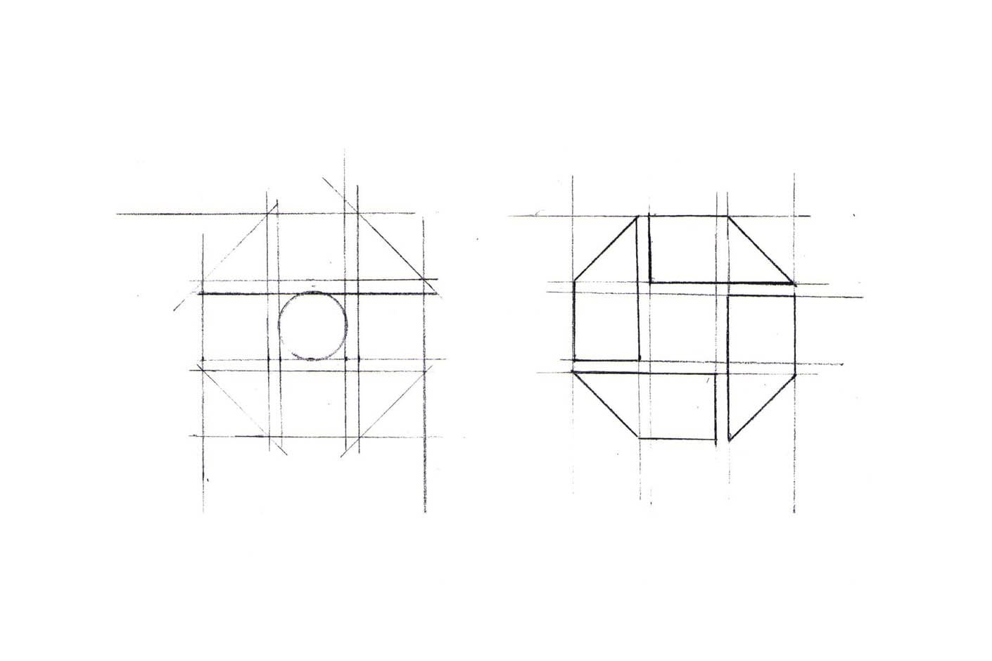

If we examine the Chase symbol, we find that it meets all of our criteria for an effective logo:
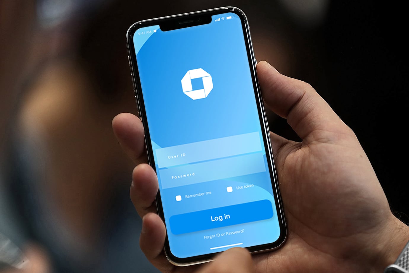
It is an abstract mark—a stylized homage to the primitive water pipes laid by the Manhattan Company (which later became Chase Bank). The shapes are perfectly balanced, and ridiculously simple. You’d recognise this logo anywhere, and its dimensions are perfectly suited for a smartphone app icon—even though it was designed in 1961, before computers existed. It doesn’t take up more real estate than necessary, and is both bold and iconic enough to be memorable.

Okay, enough about Chase now. I promise.
How to develop a successful brand (and an effective logo)
Earlier in this article I included an illustration of the brand pyramid, as I see it. Here it is again:

You’ll notice it includes something that we haven’t talked about:
Strategy.
You see, great branding is always the result of great brand strategy. Without foresight and guided execution, any effort to build your brand is just going to be a shot in the dark.
But for some people, “strategy” is just corporate gobbledygook. What does it actually do for businesses?
Your brand strategy defines and clarifies who you are as a company. What your beliefs are, what your brand personality is: your look and feel as well as your tone of voice. It narrows down and describes in detail who your ideal customers are, and what value proposition you have to offer them. It helps you filter out marketing channels that are unlikely to yield results for you, and it helps you communicate with your ideal customers in a compelling way.
Here’s an example of great brand strategy in action, and how it affects everything from logo design, to communication, to your business model itself:
There are tens of thousands of gyms in the United States. Two of them are Equinox, and Planet Fitness.
On the one hand, you have Equinox: a luxury gym that refers to itself as a “club” and features stylish ads populated with models sporting sculpted abs and chiseled jawlines. On the other hand, you have Planet Fitness: a low-cost gym that promotes the concept of a “judgment-free zone” and features friendly ads with smiling, average joes and janes in t-shirts and sweatpants.
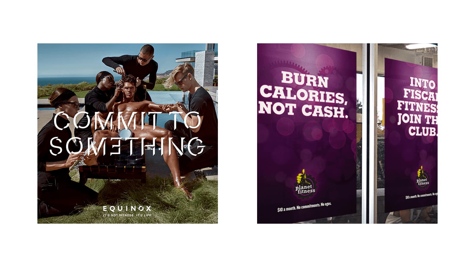
The Equinox logo is a monochromatic, minimalistic wordmark, while the Planet Fitness logo is yellow and purple, and features a hand extending from a cogwheel, making a thumbs-up sign.

Equinox is positioned as a premium gym for the rich and famous (or people who aspire to be rich and famous), whereas Planet Fitness is positioned as a gym for everyone who’s intimidated by the idea of going to the gym. Equinox enlists a small number of dedicated people at a high price point, and Planet Fitness seeks a large number of less-consistent members at a low price point. They both know their target audiences and are really effective at appealing to them on both an emotional and practical level.

Neither approach is right or wrong: in fact, they are both brilliantly effective and massively successful (both have grown into national chains). And even though they are both gyms, they are not in competition with each other.
Hopefully by now, you have a crystal-clear idea of what differentiates a brand from a logo, and the role brand identity plays in the big picture.
So… How about that logo design?
We started this article by observing that a lot of business owners rush to design a logo as soon as they start their business.
I claimed that a logo is the last thing most businesses need. I meant it in a very specific sense:
Before you design your logo, you need to define your brand strategy:
- Your core values
- The look and feel of your brand
- The tone of voice that you communicate in
- Your ideal customers and what you do to bring value to their lives
- What sets you apart from your competitors
- What marketing channels you should focus on
Once you have all of those things, then you can design your logo and the rest of your brand identity.
Printable strategy worksheet
When we help clients develop their brand strategies, we have a thorough process that consists of multiple interactive workshops and an in-depth competitive analysis based on research into your specific competitive landscape.
At the end of a strategy project, we have created half a dozen booklets and slide decks that include in-depth customer profiles, brand attributes, value proposition definitions, competitive research, and a toolkit for communicating with your ideal customers and guiding any design projects.
We offer our strategy projects to established small businesses and start-ups for $3,500. The project typically runs for about two weeks, depending on your scheduling availability for the workshops.
Now, with that in mind, I know some business owners simply don’t have the funds to invest in a professionally facilitated brand strategy project.
If that’s you, I’ve prepared a printable mini strategy worksheet that you can use instead. It’s not a substitute for going through a full brand strategy process with a professional, but my hope is that it will at least put you in a better situation than having no strategy at all.
To gain immediate access to the mini strategy worksheet, please fill out your email address below, and I will send the file to you via email.