Table of contents
Every single month, tens of thousands of people google the “best practices” in various marketing-related fields.
Branding best practices, marketing best practices, design best practices… You get the idea.
If you’re one of those people, I’m here to tell you to stop.
Now… don’t get me wrong. I like to learn from other people too. There’s no sense in reinventing the wheel every time you try to accomplish something.
But the current overbelief in “best practices” is killing creativity. And it might just be killing your business, too.
Why you should ignore best practices
The way I see it, there are at least two serious problems with adhering to best practices.
Problem #1: You’re being a lemming
If everyone in the world jumped off a cliff, would you do it too?
Sure, some really successful businesses may be doing X. But have you stopped to consider why they’re doing X? And moreover — if doing X is actually a benefit to them?
Lars Lofgren, the former Director of Growth at KISSmetrics (a software company) shares how the company allowed a chatbot to stay on their website for years… Despite knowing that it hurt their conversion rates and revenue.
Why? Their sales department “wanted one.” Presumably because “everyone else has one.” (A chatbot is one of those little chat widgets that a lot of companies have in the bottom right corner of their websites.)
Now, KISSmetrics is a very successful company. But not because of their chatbot.
When you copy what other companies are doing, you do so with very limited information. Perhaps, like KISSmetrics, they’re successful in spite of the very thing you intend to copy.
And even if X works for them, what’s to say it will work for you?
Of course, you might counter that the fact that a lot of businesses do X and are successful would suggest that X in general is at least not detrimental and possibly even at least somewhat beneficial. Basically, applying evolutionary theory to business.
That’s a reasonable counter. But of course, you don’t know that to be true either. It could very well be that more businesses that did X failed than succeeded. You just haven’t heard of them because of survivorship bias.
Problem 2: It leads to marketing incest
I don’t know if “marketing incest” is actually a term that people use. If it isn’t, I’m coining it:
Marketing incest
noun1: Marketing (design, copywriting, or campaign) that so closely conforms to industry trends as to constitute a crime against creativity:
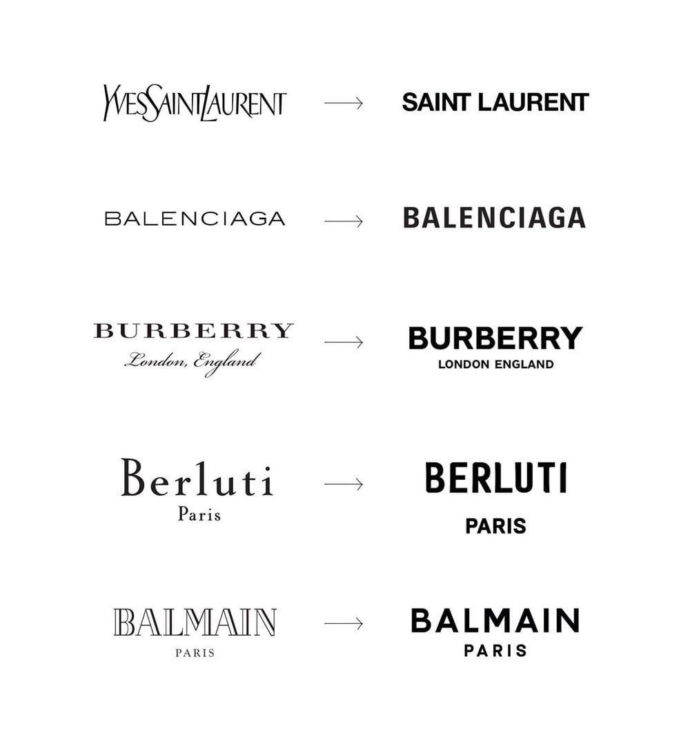
Did you see Burberry’s rebrand? They used to have that cool knight illustration but now their logo just looks like every other sans-serif based high fashion brand. It’s total marketing incest.
Or something like that. A more PG term would be “homogenisation.” But I like my version better because it provokes the appropriate level of disgust that people should feel towards this phenomenon.

The big trend in visual branding for the past couple of years has been the adoption of non-descript sans-serif wordmarks.
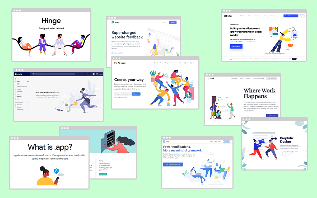
Another example of marketing incest is the gangly-armed cartoon illustration style that literally every single startup and tech company uses in their marketing materials.

The thing about marketing (and design in service of marketing) is that one very important factor that makes it effective is the extent to which it stands out.
If your logo doesn’t stand out, it doesn’t get noticed, and will be swiftly forgotten.
If your video ad doesn’t stand out, it doesn’t get noticed, and will be swiftly forgotten.
If your website doesn’t stand out, it doesn’t get noticed, and will be swiftly forgotten.
When every company is saying the same things in the same ways, people tune out. Most marketing efforts are rejected by consumers as noise. And rightly so.
Marketing incest causes you to blend into the background. It strips your brand of the things that make you unique and identifiable to people. Identifiability and memorability are important competitive advantages, but sooo many companies are willingly giving them up just so they can keep up with trends.
The role of creativity in marketing
There are lots of aspects of your business where creativity is a bad thing.
If you’re a restaurant owner, you don’t want to get “creative” with the health and safety standards, for example. And you definitely don’t want your accountant to engage in some “creative accounting.”
But things are very different when it comes to the aspects of your business that actually drive growth: product and marketing.
Creativity plays a vital role in marketing. Gary Vee (you know that loudmouth guy on YouTube who has a videographer following him around all day at work?) is famous for saying creativity is the factor for success. I agree with him.
If you sacrifice creativity, you sacrifice your competitive advantage. And probably your soul too.
Now, the nature of creativity is such that it usually fails. (Though having a good process will help.) Innovation is, by definition, ineffective. You have to try many things until you get it right. But when you do get it right… You really get it right.
The role of best practices
I’ve been ragging a lot on best practices in this article. But like I mentioned earlier, I do believe in learning from others. There’s no sense in reinventing the wheel every time you need to drive somewhere.
Basically: true best practices do have a role in marketing.
But we need to recognize two things:
- Most “best practices” are not actually true best practices (i.e. things that are universally recommended for every business out there)
- Best practices are not religious dogma. Yes, you should know the “rules”—but you also shouldn’t be afraid to break them
How I avoid marketing incest
The best way I have found to avoid marketing incest is to spend way more time talking to my clients about their company:
- What their values are,
- how they desire to be perceived,
- what makes them unique,
- what sort of person their ideal customer is,
- etc.
The answers to these questions become the basis for all my decisions about design and messaging. And when my clients ask me if they should pursue this or that marketing tactic, we can very easily check if it’s aligned with their core values and their desired brand image (or if they’re just having shiny-object syndrome).
Skin in the game
I try to avoid giving out advice like this if I’m not willing to put my money where my mouth is.
So when I launched the new version of my agency website in January 2020, I put a testimonial at the top of the home page, and a more formal and benefits-driven “intro” section below it.
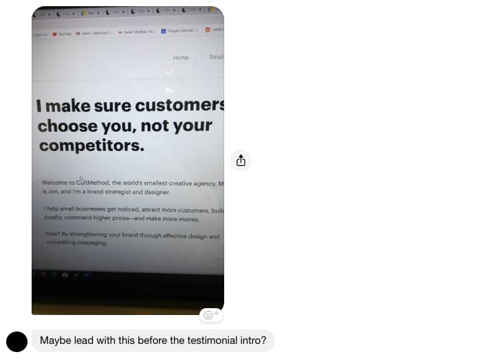
When I sought out the feedback of some friends who are also in marketing, most of them suggested that I reverse the order of these sections (to lead with a value proposition is generally considered a best practice).

I couldn’t help but laugh.
I decided to lead with the testimonial (and a large photo of myself) because people aren’t used to seeing that when they land on someone’s home page.
If you scroll up to the image with all the gangly-armed illustrations, you’ll notice every website does things the way my friends suggested. Personally, I’m numb to it. Nothing you say about yourself can wow me anymore.
But slap a testimonial on there instead? And a photo of yourself, to show that there’s an actual human being behind this website and that you’re not just some anonymous corporation? Now you’ve got my attention.
So I’m giving this unorthodox structure a shot.
Maybe it’ll tank my business (I doubt it). Maybe enough people will be intrigued by the change of pace that they decide to stick around. And if nothing else, at least my website doesn’t look like every other “creative” agency website in the world.